

Creating a site begins with a structure plan, selection of key queries, writing content, selecting images, and more. And many aspiring publishers make a serious mistake when they don’t take the right fonts choice seriously.
Font selection is a whole science that needs to be taken seriously. After all, you need to choose not on the basis of whether you like it or not. Fonts belong to different families, which have clear distributions for application. Some fonts are suitable for a blog, but will look out of place on an online store site, etc. The style of the site should match the selected fonts for a harmonious and purposeful appearance of your site.
Below is a selection of different free fonts that you can use when creating your websites.
What is a font?
Font (German: Schrift from schreiben “to write”) is a graphic drawing of the styles of letters and signs that make up a single stylistic and compositional system, a set of characters of a certain size and pattern. A typographic font is a set of typographic letters intended for typing. A computer font is a complete set of characters for printing or displaying on a monitor screen of a specific typeface.
The main characteristics of fonts:
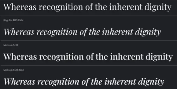
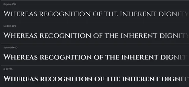
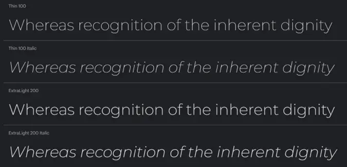
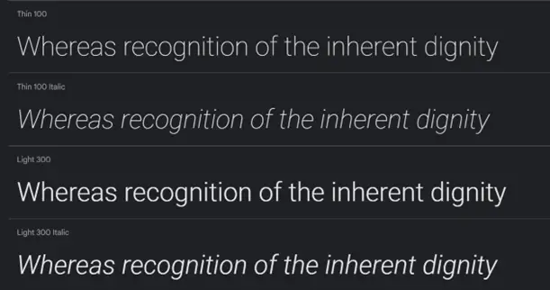
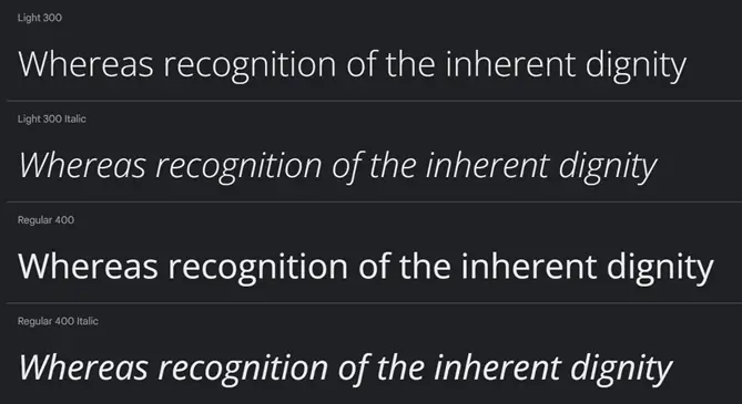
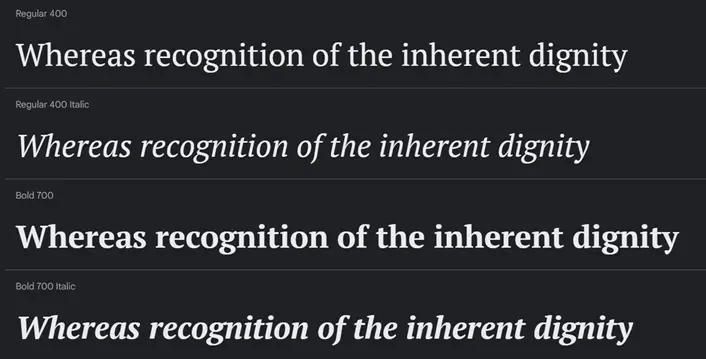
style: straight, italic;
saturation: light, bold, bold (the ratio of the thickness of the stroke to the width of the intra-letter gap);
width: normal, narrow, wide, fixed-width font;
size (point size) in points (1 point = 1/72 inch);
clarity (clear, blurry);
contrast;
distinguishability;
readability;
capacity: (narrow, voluminous).
Playfair Display
This typeface is a great example of a transitional style, as it was formed in the late 18th century when all the writing of the time moved from quills to pointed pens. Since then, this font has evolved and changed, but the central idea has remained the same. Until our time, he has found thinner lines, clear contrast and elegant style.
This font is great for headings and works well with the Georgia font as the body text of the site. In terms of style, it will look harmonious in news and journalistic formats, and will produce the desired effect.
Cinzel
This typeface takes its stylistic origins from ancient Rome and is based on its classic Latin typography. But over time, it has become very modern, which has had a good effect.
This font will look good on headings or small texts of large size. Since the font has notches, it will lose readability at small sizes.
Montserrat
Montserrat is a relatively modern font that appeared in the first half of the twentieth century. It has a clearly defined geometric stylization.
According to its characteristics, it is a sans-serif typeface, so it is perfect for both headings and body text. It has many options for possible use. If you want to make a modern, stylish or minimalistic site, then this font is worth a try.
Roboto
This font is the basis of the basics, even Google uses it in their main typography. It can be described as a classic geometric font.
It has many shapes, and since it’s from the sans-serif family, you can use it everywhere as the main font. It will become a stable and not flashy foundation of your site, and you will be able to put a pronounced emphasis on what you need. You don’t have to worry about distracting readers, as it will be exceptionally informative and highly readable for the audience.
OpenSans
This is a nice free font that was developed for Google. This font is from the sans-serif family, so it looks great on any site with text content. Another advantage is that it has a high level of clarity and legibility regardless of the size of the text. You don’t have to worry because Open Sans is visually well perceived and easy to read, it is calm and not expressive. Can be used for headings, text, notes, and more.
To emphasize Open Sans and underline its sting, it can be used with fonts such as Montserrat, Playfair Display, Georgia and the like.
Helvetica
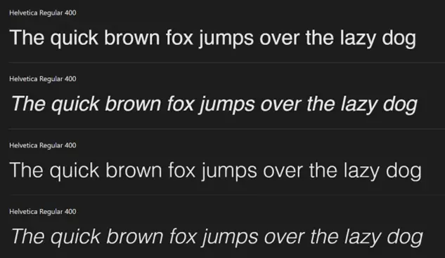
Helvetica is such a font without which it is impossible to imagine the web space. This is truly the most popular and frequently used font on websites. The history of the font dates back to 1950 and has improved to the present day.
Stylistically, this font belongs to the modern classics, without notches, with support for a large number of languages and sizes. This is a system font that can be used for headings, text, notes, and so on.
Helvetica pairs beautifully with Garamond. Since these fonts are of the same style, they are similar in size. But Garamond has serifs, so together in contrast they perfectly complement each other.
PT Serif
This is a universal font for the site, which has many variations in size, weight and saturation. The font has the ability to work in a large number of different languages. In terms of stylization, the font is large, with moderate strokes and serifs.
PT Serif is a modern and comfortable font that is often used to make accents in text. Therefore, if you want to make an expressive title, then this font will do the job.
Tangerine
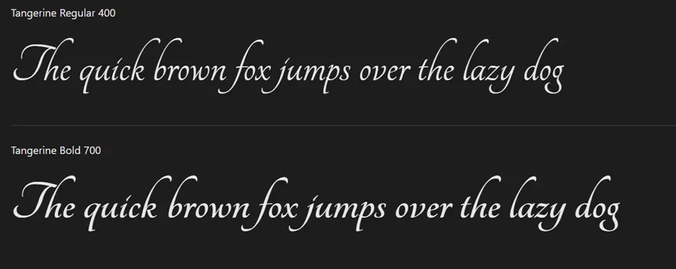
The Tangerine font is like a cherry on top of a cake. If you want to put a bright accent on something, or show significance, importance or elegance of what is written, then this typeface is perfect.
The main advice regarding its use is to apply it very carefully. Because if you do it in the wrong place or use it too often, the effect will be spoiled and the text will be ridiculous. But if you do it right, you and your audience will love the effect.
Beauty is in the details
A beautiful and correct font on the site is very important, but it is even more important that the font is appropriate and understandable. The science of typography teaches us the art of using certain fonts in such a way that it produces the desired effect. The font performs not only an informative function on the site, but can also act as an element to focus the attention of site readers, and the font can also be a highlight of the site design. Therefore, study different options and apply correctly.

Some popular fonts for websites include Arial, Helvetica, Times New Roman, Georgia, Open Sans, Roboto, and Lato.