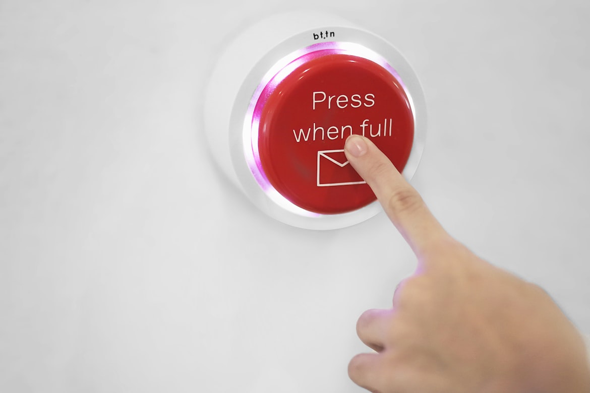
If you think that content and design are enough for a successful website, then this is not so! On any website, a well-designed call-to-action (CTA) button is an essential element for increasing conversions and getting the most out of your audience’s interaction with you. An effective CTA button grabs attention, motivates you to take action, and directs you to the desired result. Next, we’ll look at the key strategies and best practices for creating a good call-to-action button that converts. Let’s start!
Understand your Audience
Before designing your call to action button, it’s crucial to understand your target audience. Conduct thorough research to gain insights into their needs, preferences, and motivations. This knowledge will help you tailor your CTA to resonate with your audience and increase the likelihood of conversions. Consider demographics, behavior patterns, and psychographics to create a button that speaks directly to their desires.
Use Action-Oriented Language
The language you use in your call to action button should be compelling and action-oriented. By utilizing strong action verbs and concise phrases, you can create a sense of urgency and entice your audience to act immediately. For example, instead of using generic phrases like “Click Here,” consider more persuasive options like
or
Optimize Button Placement
The placement of your call to action button plays a significant role in its effectiveness. It should be strategically positioned so that it can easily catch the viewer’s eye. Typically, placing the CTA button above the fold, within the reader’s natural line of sight, leads to better conversions. Additionally, consider the surrounding design elements to ensure that the button stands out and grabs attention.
Emphasize Visual Design
Visual design elements have a powerful impact on the performance of your call to action button. Here are some tips to create an appealing and visually distinct CTA:
- Use contrasting colors: Choose colors that stand out from the rest of your website or landing page. The button should catch the viewer’s attention immediately. Make sure the color scheme aligns with your brand, while also providing a clear visual contrast.
- Utilize whitespace: Incorporating whitespace around your CTA button helps it stand out and prevents distractions. This negative space draws attention to the button, making it easier for users to locate and engage with it.
- Select an appropriate size: The size of your call to action button should be proportional to its importance. It should be large enough to grab attention, but not so big that it overwhelms the surrounding content.
Create a Sense of Urgency
One effective technique to increase conversions is to create a sense of urgency within your call to action button. By instilling a fear of missing out (FOMO), you can motivate users to take immediate action. Incorporate time-limited offers, limited stock notifications, or countdown timers to convey the urgency and scarcity of the opportunity. This psychological trigger can significantly boost conversion rates.
Leverage Social Proof
People are more likely to take action when they see others doing the same. Integrate social proof elements into your call to action button to build trust and credibility. This can be done by displaying the number of satisfied customers, positive reviews, or testimonials. By showcasing that others have benefited from the desired action, you create a sense of trust and encourage conversions.
Optimize for Mobile
In today’s mobile-driven world, optimizing your call-to-action button for mobile devices is paramount. Ensure that the button is responsive, meaning it adjusts seamlessly to different screen sizes. Keep the text large enough to read on smaller screens, and provide ample spacing to prevent accidental clicks. Conduct thorough testing across various mobile devices and platforms to guarantee a seamless user experience.
Test and Analyze
Creating an effective call to action button is an iterative process. To maximize its conversion potential, it’s essential to test different variations and analyze the results. Here are some testing and analysis strategies to implement:
- A/B testing: Create multiple versions of your call to action button and test them simultaneously to see which one performs better. Vary elements such as color, text, size, placement, and design. Analyze the data to identify the most effective combination and refine your CTA accordingly.
- Heatmap analysis: Utilize heatmap tools to track user interaction with your website or landing page. This will provide valuable insights into where users are focusing their attention and how they engage with your call to action button. Make data-driven decisions based on this information to optimize the placement and design of your CTA.
- Conversion tracking: Set up conversion tracking to monitor the performance of your call to action button. Identify key metrics such as click-through rates, conversion rates, and bounce rates. This data will help you understand user behavior and make data-driven decisions to improve your CTA’s effectiveness.
- User feedback: Actively seek feedback from your audience to understand their perception of your call to action button. Conduct surveys, and user testing sessions, or gather feedback through social media channels. Incorporate valuable insights and suggestions into your CTA design to enhance user experience and drive conversions.

Keep it Simple and Clear
Simplicity and clarity are crucial when it comes to creating a good call to action button. Avoid cluttering the design with unnecessary elements or excessive text. Keep the message concise, direct, and easy to understand. Use straightforward language that leaves no ambiguity about the action you want the user to take. The simpler and clearer your CTA, the higher the chances of conversions.
Offer Value and Benefits
Highlight the value and benefits users will receive by clicking on your call to action button. Communicate what they will gain, whether it’s access to exclusive content, a special offer, or a solution to their problem. The more compelling the perceived value, the more likely users are to convert. Use persuasive copy to convey the benefits effectively.
Examples of Good Call to Action Buttons
“Get Started Now”: This call to action button is clear, direct, and encourages immediate action from the user.
“Sign Up for Exclusive Offers”: This button appeals to the user’s desire for exclusive benefits and encourages them to sign up for a newsletter or membership.
“Buy Now and Save 20%”: This call to action button combines a sense of urgency and a discount offer, motivating users to make a purchase and take advantage of the limited-time discount.
“Join the Community”: This button invites users to join a community or social platform, appealing to their desire for connection and engagement.
“Request a Demo”: This call to action button is commonly used in software or service industries to encourage users to request a product demonstration or trial.
“Book Your Appointment”: This button is effective for businesses like salons, spas, or healthcare providers, as it prompts users to schedule an appointment or consultation.
“Get Your Free Ebook”: Offering a free resource, such as an ebook, in exchange for an action like providing an email address, is a great way to entice users to click on the call to action button.
“Donate Now to Make a Difference”: This button appeals to users’ philanthropic instincts and encourages them to contribute to a charitable cause.
“Subscribe for Updates”: This call to action button is used to encourage users to subscribe to newsletters, blogs, or content updates, ensuring they stay informed and engaged with the brand or website.
“Upgrade to Premium”: This button is often used in freemium models or subscription-based services, enticing users to upgrade their accounts or access additional features by clicking on the call to action button.
Remember, the effectiveness of a call to action button depends not only on the wording but also on its placement, design, and overall context on the website or landing page.
Don’t miss the opportunity!
Crafting a good call to action button that converts requires a combination of understanding your audience, persuasive language, strategic placement, visual design, urgency, social proof, mobile optimization, and data analysis. By implementing these strategies and continuously testing and refining your CTA, you can increase conversions and drive the success of your affiliate marketing campaigns. Remember to always put yourself in the shoes of your audience and aim to create a seamless user experience that encourages action.
FAQ
You can track the performance of your CTA buttons by utilizing website analytics tools, such as Google Analytics. Set up conversion tracking to measure the number of clicks and conversions generated by each CTA. Monitor the click-through rate (CTR), conversion rate, and overall user behavior to assess the effectiveness of your CTA buttons and make data-driven optimizations.


